di Ivan Quaroni
“La perfezione si ottiene non quando non c’è più nulla da aggiungere,
ma quando non c’è più niente da togliere.”
(Antoine de Saint-Exupéry)
“La semplicità nell’arte è, in generale, una complessità risolta.”
(Constantin Brâncuşi)
Siamo in un’epoca di conclamata sublimazione della tridimensionalità, effetto evidente di una fase ultra-mimetica delle tecnologie digitali. Il 3D ormai non imita più la realtà, ma la supera in nome di una super definizione dell’esperienza ottica che, però, finisce per appiattire il contributo immaginativo dello spettatore. Credo sia successo a ognuno di noi di sperimentare il fastidio generato dalla visione di un film (oppure di un videogioco) in 3D, in cui l’applicazione forzosa di tale tecnica ha provocato un impoverimento, anziché un arricchimento del godimento estetico o ludico. Quello che i geek degli effetti speciali e gli smanettoni dell’industria videoludica non riescono a capire è che la mente umana contribuisce attivamente alla visione, alterando e ristrutturando le percezioni visive in base ai concetti già immagazzinati. Fenomeni come lo scotoma, l’effetto priming, la misdirection passiva, la cecità selettiva e altri curiosi trucchi mentali sono, infatti, ben noti agli scienziati e agli illusionisti. René Magritte sosteneva che “la mente ama le immagini il cui significato è ignoto, poiché il significato della mente stessa è sconosciuto”. Guardare un’immagine, quindi, è come ingaggiare una sfida con il mistero che essa sottende. Quando, invece, l’immagine contiene troppe informazioni, quando è denotativa, eccessivamente didascalica rispetto al proprio contenuto, il mistero si dissolve.
I lavori pittorici di Andy Rementer e Fulvia Mendini non corrono questo rischio. Nonostante l’apparente semplicità dei loro dipinti, peraltro non privi di dettagli preziosi e riferimenti colti, Rementer e Mendini dimostrano di aver ben compreso il potenziale comunicativo, ma soprattutto seduttivo, del linguaggio bidimensionale, il quale sopperisce alla sottrazione degli elementi prospettici e chiaroscurali con l’aumentata capacità allusiva di linea e colore. Tipica di molte forme di arte antica, così come di quella bizantina e medievale fino al Trecento, la bidimensionalità è stata una caratteristica che ha attraversato molte correnti dell’arte del Novecento. Essa consiste in una rappresentazione concentrata nei soli parametri di altezza e larghezza, in cui la rinuncia a ogni effetto di profondità spaziale finisce per alterare anche la dimensione temporale e narrativa.
Un esempio di questo meccanismo è Guernica di Picasso, forse il più celebre capolavoro di arte bidimensionale di tutti i tempi, dove la sintesi pittorica e l’allineamento anti-prospettico di tutte le figure sullo stesso piano producono il più alto modello di narrazione simultanea, sulla scia di quanto già avveniva nella struttura paratattica dei rilievi paleocristiani e degli affreschi altomedievali, in cui si affastellavano i diversi episodi di una storia.

Fulvia Mendini, Belide, 2015, acrilico su tavola, 23×17 cm
Né l’artista americano, né quella italiana si servono, però, di questo espediente. Più che nell’impianto narrativo – stringatissimo nel caso di Andy Rementer e totalmente abolito nei dipinti di Fulvia Mendini – gli effetti dell’adozione di un linguaggio sintetico si avvertono soprattutto nell’impatto iconico delle figure, in parte ereditato dalla Pop Art e in parte dall’economia progettuale e comunicativa del design, cui entrambi devono la propria formazione.
Originario del New Jersey, Andy Rementer ha, infatti, studiato Graphic Design alla University of the Arts di Philadelphia ed ha poi lavorato come illustratore e fumettista per testate come il New York Times, il New Yorker, Apartamento Magazine e Creative Review e, come animatore, con l’emittente MTV e la casa di produzione cinematografica Warner Bros. Per due anni è stato a Treviso alla Fabrica, il centro di ricerca sulla comunicazione di Benetton Group, in compagnia di un manipolo di ricercatori internazionali specializzati in grafica, design, fotografia, video, musica e giornalismo. Durante la sua permanenza in Italia, l’artista ha sviluppato un linguaggio visivo ispirato oltre che al design, al fumetto e ai cartoni animati, anche all’arte europea e, in particolare a quella medievale, bizantina e rinascimentale conosciuta nelle sue frequenti incursioni a Venezia.
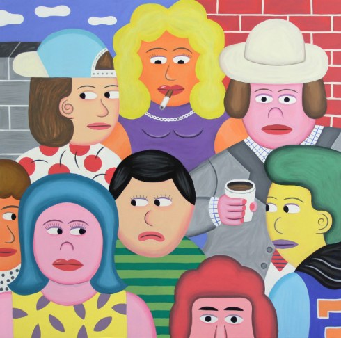
Nelle opere di Andy Rementer, la flatness si esprime attraverso una teoria di personaggi dalle sagome compatte e dai contorni definiti, spesso stagliati sullo sfondo di un paesaggio urbano. La metropoli è, infatti, protagonista di una serie di episodi fulminei, di storie semplicissime che, però, rivelano il carattere straordinario dell’esperienza quotidiana. L’artista annulla i dettagli di spazio e tempo e cala i suoi personaggi in una dimensione silente e sospesa di sapore quasi Novecentista. Non a caso, annovera Ferdinand Léger tra le sue principali influenze, anche se la propensione per la stringatezza e la sintesi gli deriva dalla lettura dei racconti di Raymond Carver, dove l’economia narrativa si combina con un linguaggio conciso e minimale.

Andy Rementer, Divano Diva, 2015, oil on canvas, 76×122 cm
Se le forme piene delle sue figure ricordano a tratti quelle dipinte dagli europei nel clima di Ritorno all’ordine degli anni Venti e Trenta, gli oggetti e i complementi d’arredo che compaiono negli interni domestici denotano, invece, il suo duplice interesse per il design e per la Metafisica italiana. Da buon cosmopolita, e con la spavalderia di chi è abituato a trasgredire ogni confine disciplinare, Rementer condensa nel lessico pop una varietà d’interessi, che stanno all’incrocio tra passato e presente, ma anche tra arte, grafica e illustrazione. E, così, reinventa una mitologia urbana allegramente nevrotica, vivacemente malinconica, che ben si adatta alle contraddizioni della società moderna.
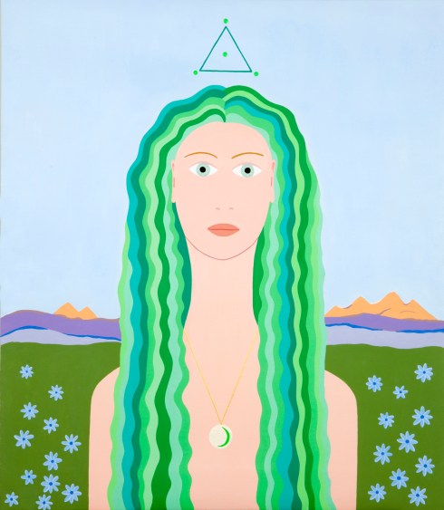
Dopo gli studi di grafica e illustrazione all’Istituto Europeo del Design di Milano, Fulvia Mendini ha lavorato all’Atelier Mendini e, parallelamente, ha sviluppato la propria ricerca pittorica e decorativa concentrandosi in particolare sul ritratto e sul mondo delle forme naturali. Artista versatile, Mendini ha collaborato con artigiani e aziende, realizzando ceramiche, sculture, tappeti, murales, gioielli e borse. La sua pittura, caratterizzata (soprattutto nei ritratti) da un’impostazione frontale e ieratica, ricca di citazioni colte, è il risultato di una raffinata mescolanza di stili artistici e grafici. Se nelle sue moderne Madonne è lecito rintracciare l’influenza di molta pittura rinascimentale – da Giovanni Bellini a Piero della Francesca, fino a Pisanello – nei ritratti più recenti affiora, per la prima volta un vivo interesse per la pittura simbolista, filtrata però dalla sua tipica sensibilità lineare.
La reinventata tipologia mariana della Mendini sfocia, così, in una carrellata di fisionomie che alludono all’eterno femminino decadente, epurato, però, di ogni connotato drammatico. Fate e ninfe rubate al catalogo dei Fairy Tales Painting vittoriani si accompagnano, infatti, ai classici modelli di veneri preraffaellite e alle fatali dame secessioniste interpretate alla luce di una grammatica ultrapiatta che fa pensare alla pittura segnaletica di Julian Opie. Venus Verticordia, a cominciare dal titolo, è una rilettura del celebre dipinto di Dante Gabriel Rossetti corredato da floreali allusioni all’immaginario ornamentale di William Morris, mentre la più moderna Belide, sovrappone al nitore fotografico di Loretta Lux il ricordo di un ritratto di Helene Klimt, figlia del famoso maestro viennese.

Fulvia Mendini, Madonna della conchiglia, 2014, acrilico su tela, 69×60 cm
Inedita, invece, è l’attrazione di Fulvia Mendini verso il paesaggio, anche questa volta derivato da suggestioni simboliste. La natura, finora confinata al mondo di piante e fiori, assume finalmente una dimensione ambientale e si distende, dietro i ritratti in primo piano, in orizzonti montani che molto devono ai paesaggi alpini di Giovanni Segantini e degli svizzeri Ferdinand Hodler, Cuno Amiet e Alexandre Perrier.
L’artista costruisce un universo bidimensionale apparentemente semplice, dove ogni figura assume una fisionomia aliena e ogni landscape sembra il fondale di un videogame, ma dentro i suoi paradisi terrestri, aristocraticamente elementari e improntati al più puro godimento ottico, si nascondono riferimenti a raffinati, preziosi episodi della storia dell’arte. Ciò che sembra una pittura facile, immediatamente fruibile, è invece un ipertesto visivo, che nasconde in superficie un numero impressionante d’informazioni. La forza dei linguaggi di Fulvia Mendini e Andy Rementer sta tutta qui. Ossia nell’aver compreso che – come diceva Bruno Munari, facendo eco a Leo Longanesi – “complicare è facile, semplificare è difficile”.
Info:
Fulvia Mendini | Andy Rementer - The age of innocence
a cura di Ivan Quaroni
11.02 - 2.04.2016
Antonio Colombo Arte Contemporanea
Via Solferino 44, Milano
Tel/Fax 02.29060171 - info@colomboarte.com
The age of innocence
by Ivan Quaroni
“Perfection is achieved not when there is nothing more to add, but when there is nothing left to take away.”
(Antoine de Saint-Exupéry)
“Simplicity in art is generally complexity resolved.”
(Constantin Brâncuşi)
Fulvia Mendini, Lollipop
We are in an era of clear sublimation of three-dimensionality, an evident effect of an ultra-mimetic phase of digital technologies. 3D no longer imitates reality, but surpasses it in the name of a super-definition of the optical experience that, however, winds up flattening the imaginative contribution of the spectator. I think everyone has experience the irritation generated by watching a film (or a video game) in 3D, in which the enforced application of the technique leads to an impoverishment, rather than an enhancement, of aesthetic or recreational pleasure. What the special effects geeks and the tweakers of the video game industry cannot manage to understand is that the human mind takes an active part in viewing, altering and restructuring visual perceptions based on already absorbed concepts. Phenomena like the scotoma, the priming effect, passive misdirection, selective blindness and other curious mental tricks, have been known for a long time to both scientists and stage magicians.
René Magritte believed that “the mind loves images whose meaning is unknown, since the meaning of the mind itself is unknown.” To look at an image, then, means engaging in the challenge of a mystery the lies behind it. When the image instead contains too much information, when it is denotative, excessively caption-like with respect to its content, the mystery dissolves.
The painted works of Andy Rementer and Fulvia Mendini do not run this risk. In spite of the apparent simplicity of their paintings, which are not however lacking in precious details and erudite references, Rementer and Mendini demonstrate that they are understood the communicative but above all seductive potential of the two-dimensional language, which makes up for the subtraction of elements of perspective and chiaroscuro with an augmented allusive capacity of line and color. Typical of many forms of antique art, like Byzantine and medieval art until the 1300s, two-dimensionality has been a characteristic that crosses many 20th-century currents. It consists of a representation that concentrates only on parameters of height and width, in which the sacrifice of any effect of spatial depth also winds up altering the temporal and narrative dimension.
One typical example of this mechanism is Picasso’s Guernica, perhaps the most famous work of two-dimensional art of all time, where the pictorial synthesis and anti-perspective alignment of all the figures on the same plane produce the loftiest model of simultaneous narration, in the wake of what had already happened in the paratactic structure of Paleo-Christian reliefs and the frescoes of the Early Middle Ages, clustering the various episodes of a story. Neither of the two artists makes use of this expedient, however. More than in the narrative plot – very pithy, in the case of Andy Rementer, totally abolished in the paintings of Fulvia Mendini – the effects of the use of a synthetic language can be seen in the iconic impact of the figures, partially inherited from Pop Art and partially from the communicative economy of design, in which both have a background.
Andy Rementer, La Gazza ladra, 2015, oil on canvas, 122×76 cm
Hailing from New Jersey, Andy Rementer studied Graphic Design at the University of the Arts in Philadelphia and then worked as an illustrator and cartoonist for periodicals like the New York Times, the New Yorker, Apartamento and the Creative Review, and as an animator for MTV and Warner Bros. He spent two years in Treviso at Fabrica, the communications research center of Benetton Group, in the company of a handful of international researchers specializing in graphics, design, photography, video, music and journalism. During his time in Italy the artist developed a visual language driven not only by design, comics and cartoons, but also by European art and, in particular, medieval, Byzantine and Renaissance art, encountered in his frequent trips to Venice.
In the works of Andy Rementer flatness is expressed through a series of characters with compact silhouettes and sharp edges, often standing out against the backdrop of a cityscape. The metropolis is the protagonist of a series of quick episodes, very simple stories that nevertheless reveal the extraordinary character of everyday experience. The artist annuls the details of space and time and sets his characters in a silent, suspended dimension with almost 20th-century overtones. It is no coincidence that he cites Ferdinand Léger as one of his main influences, though the tendency to be concise comes from the reading of stories by Raymond Carver, where narrative economy is combined with terse, minimal language.
Andy Rementer, Together
While the full forms of his figures remind us at times of those painted by the Europeans in the context of the “return to order” of the 1920s and 1930s, the objects and furnishings that appear in the domestic interiors point to his dual interest in design and Italian Metaphysical Art. As a proper cosmopolitan, and with the brashness of one accustomed to crossing all disciplinary boundaries, Rementer condenses a variety of interests in the pop lexicon, at the intersection between past and present, but also between art, graphics and illustration. Doing so, he reinvents a cheerfully neurotic, vivaciously melancholy urban mythology, well-suited to the contradictions of modern society.

Andy Rementer, La pausa
After studying Graphic Design and Illustration at the European Design Institute in Milan, Fulvia Mendini worked at Atelier Mendini and, at the same time, developed her own research on painting and decoration, concentrating in particular on portraiture and the world of natural forms. A versatile artist, Mendini has worked with artisans and companies, making ceramics, sculptures, carpets, murals, jewelry and handbags. Her painting, characterized (especially in the portraits) by a frontal, hieratic arrangement, full of erudite citations, is the result of a refined mixture of artistic and graphic styles. While in her modern Madonnas we can see the influence of Renaissance painting – from Giovanni Bellini to Piero della Francesca, all the way to Pisanello – in the more recent portraits a lively interest surfaces for the first time in Symbolist painting, but filtered by her typical linear sensibility.

Fulvia Mendini, Madonnina dell’umiltà, 2015, acrilico su legno, 23×1\7 cm
The reinvented Marian typology of Mendini converges in a medley of physiognomies that allude to a decadent eternal femininity, but purged of any dramatic connotations. Fairies and nymphs stole from the catalogue of Victorian “fairy painting” are accompanied, in fact, by classic models of Pre-Raphaelite Venuses and Secessionist femmes fatales interpreted with an ultraflat grammar that brings to mind the signage-like painting of Julian Opie. Venus Verticordia, starting with its title, is a re-reading of the famous painting by Dante Gabriel Rossetti, provided with floral allusions to the ornamental imaginary of William Morris, while the more modern Belide overlaps the photographic clarity of Loretta Lux with the memory of a portrait of Helene Klimt, daughter of the famous Viennese master.
Fulvia Mendini, Proserpina, 2009, acrilico su tela, 69×60
Fulvia Mendini’s attraction to the landscape, on the other hand, is unprecedented, and again comes from Symbolist suggestions. Nature, previously confined to the world of plants and flowers, finally takes on an environmental dimension and spreads, behind the portraits in the foreground, into mountainous horizons that owe a lot to the Alpine paintings of Giovanni Segantini and the Swiss painters Ferdinand Hodler, Cuno Amiet and Alexandre Perrier.
The artist constructs an apparently simple two-dimensional universe where each figure takes on an alien physiognomy and every landscape seems like the background of a video game. But inside her earthly paradises, aristocratically elementary and bent on pure optical enjoyment, references are lurking to refined, precious episodes in the history of art. What looks like easy, immediately enjoyable painting is instead a visual hypertext that conceals an impressive amount of information. The force of the languages of Fulvia Mendini and Andy Rementer lies here: in having understood that – as Bruno Munari said, echoing Leo Longanesi – “complicating things is easy, simplifying them is hard.”
Info:
Fulvia Mendini | Andy Rementer - The age of innocence
curated by Ivan Quaroni
11.02 - 2.04.2016
Antonio Colombo Arte Contemporanea
Via Solferino 44, Milano (Italy)
Tel/Fax 02.29060171 - info@colomboarte.com