di Ivan Quaroni
“The flashing and golden pageant of California!”
(Walt Whitman, Song of the Redwood-Tree, 1874)
ITA
Gli artisti californiani hanno qualcosa che li distingue da tutti gli altri artisti americani. Sarà l’aria mite e solare della West Coast, sarà, forse, la particolare influenza di esperienze come la kustom kulture, il punk e la psichedelia o dell’estetica e gli stili di vita legati al surf e allo skateboarding, sta di fatto che gli artisti del Golden State non hanno la pretenziosità un po’ snob dei newyorkesi e quasi mai si avventurano in articolate spiegazioni filosofiche delle proprie opere, convinti, come sono, che un buon lavoro si spiega da solo, senza bisogno di voluminosi e tediosi apparati critici. L’immediatezza e la riconoscibilità sono caratteristiche tipiche dell’arte californiana emersa dagli anni Ottanta in poi, insieme a una certa vena fantastica e surreale che ha generato numerose sigle e denominazioni per movimenti dai confini quanto mai labili come il Pop Surrealism o la Lowbrow Art. Etichette a parte, il denominatore comune delle molteplici frange dell’arte prodotta nell’area di Los Angeles e San Francisco è una spiccata propensione per la trasfigurazione e la metafora, insomma per quel particolare modo di raccontare la realtà “sopra righe” che mescola l’osservazione della vita quotidiana con elementi d’invenzione e riferimenti alla cultura popolare.

Jeremy Fish, ROLLING RIPPER, 2015, ink on paper, hand carved wood frame, 40,6×50,8 cm
Con Hollywood, Disneyland e la Silicon Valley, la California è, infatti, l’odierno paradigma della civiltà fantastica e virtuale, il luogo, come sostiene lo storico americano Kevin Star, in cui è più ambiguo il rapporto tra realtà e finzione, tra verità e suggestione. Oltre all’approccio fantastico, un altro aspetto interessante dell’arte underground, ammesso che si possa ancora chiamare così, è l’attitudine degli artisti a saltare gli steccati, a violare i confini disciplinari, quelli tutelati dai sacerdoti dell’arte ufficiale, con l’applicazione della propria visione artistica a ogni sorta di oggetto attraverso collaborazioni con aziende produttrici di abbigliamento, di articoli sportivi e di giocattoli, oppure con etichette discografiche, case editrici e riviste specializzate.
Jeremy Fish, Russ Pope e Zio Ziegler, tre artisti di diversa generazione, ma tutti operanti nell’area della baia di San Francisco, condividono la medesima passione verso un’arte senza frontiere, capace di spaziare dalla pittura all’illustrazione, dal murale alla customizzazione di prodotti per brand di culto come Vans, RVCA e Santa Cruz. Insomma, questi moschettieri della West Coast sanno bene che per comunicare con un pubblico più vasto la galleria d’arte e il museo non bastano. Per conquistare le persone, le immagini devono diventare popolari e riconoscibili, magari finendo su T-shirt e cappellini, scarpe e tavole da skate, manifesti e copertine dei dischi.

Russ Pope, flyer for “From Cali with Love
Gli artisti di From Cali with Love, titolo che occhieggia agli slogan delle coloratissime cartoline del Golden State, non potrebbero essere più diversi tra loro. Tracce di punk, di urban art, di psichedelia, di fumetto underground e di un po’ tutte le matrici culturali e visive del California Dreaming, affiorano in miscele diverse e originali tanto nelle opere grafiche e pulitissime di Jeremy Fish, quanto in quelle gestuali ed espressionistiche di Russ Pope e di Zio Ziegler. Eppure, ciò che li accomuna davvero è appunto il desiderio di raccontare la realtà per similitudini e allegorie, di catturare tutto il quotidiano e il fantastico della società contemporanea, così come viene percepito e vissuto nella costa sud-occidentale degli Stati Uniti d’America. Per lo scrittore Wallace Stegner, la California è come l’America, “soltanto un po’ di più”, un concentrato del sogno statunitense, l’epitome di uno stile di vita unico e riconoscibile che si esprime anche attraverso una grande varietà di linguaggi visivi.
Prendiamo, ad esempio, Jeremy Fish, street artist, illustratore e skater, considerato uno degli artisti che più ha segnato l’estetica urbana di San Francisco. Uno così non puoi rinchiuderlo in nessuna etichetta, perché nella sua arte confluiscono esperienze molto diverse tra loro, dalla formazione accademica al lavoro artistico in strada, dalla decorazione di tavole da skate alle collaborazioni con artisti della scena hip hop come Aesop Rock, fino alla definizione di un linguaggio unico e riconoscibile. Newyorchese di nascita ma californiano d’adozione, Jeremy Fish è un artista versatile, che ha saputo creare un universo alternativo all’incrocio tra biografia e immaginazione, caratterizzato da un impianto grafico netto e inconfondibile. Dentro i suoi dipinti, che spesso sembrano manifesti di una nuova araldica pop, puoi trovarci di tutto: totem fantastici e animali stilizzati, simboli e loghi, teschi e vascelli, lampade e giocattoli, ma anche ritratti di persone vere. Sembrano tavole illustrate di una fiaba urbana, ma più li guardi e più ti rendi conto che i suoi lavori sono disseminati di una fitta trama di allegorie e di indizi, una specie di sotto testo, di contro-storia che si svolge anche in secondo piano, tra le ombre proiettate dalle figure e perfino tra gli elaboratissimi intagli delle cornici.
Due esempi su tutti, Love and Companionship e Truth and Friendship, sono opere che ritraggono persone care all’artista, come la moglie Jayde e l’amico e fotografo Rick Marr, associate all’immagine degli animali che meglio ne rispecchiano il carattere, rispettivamente un gatto e un bradipo. Sono in sostanza ritratti totemici, che danno un volto e una forma comprensibili a sentimenti e relazioni della vita di tutti i giorni. Gli elementi fantastici, intendiamoci, sono sempre presenti, ma si ha l’impressione che essi rappresentino una maniera, forse la più efficace e meno retorica, per celebrare l’amore, l’amicizia e gli affetti e, in fin dei conti, per interpretare la realtà. Una spiccata vena narrativa, infatti, attraversa tutta la produzione di Jeremy Fish. Uno dei suoi temi iconografici preferiti è quello degli animali, spesso concepiti come contenitori dotati di una cerniera longitudinale che si apre a svelare la presenza di mondi alternativi, di storie che scorrono, come fiumi sotterranei, nella dimensione sommersa della memoria e in quella galleggiante della coscienza. Basta un’occhiata a The Bear’s Beehive, The Catfish Cottage o The Igloo Island, per capire che la pittura di Fish è più complessa e stratificata di quanto appaia in superficie. Le sue composizioni ricordano gli stemmi e i blasoni gentilizi del medioevo oppure le figure dei tarocchi e delle carte da gioco, per via della natura intimamente simmetrica e speculare delle immagini, dove alto e basso, esterno e interno, visibile e invisibile s’intrecciano in un rapporto di mutuo scambio simbolico. Insomma, a Jeremy Fish piace dipingere storie travestite da favole. O, se preferite, favole che sembrano la trascrizione visiva (e traslata) delle sue esperienze personali.

Russ Pope, Saturday Night Live, 2015, acrylic on sheet canvas, 46×61 cmAntoni
Anche Russ Pope ha un approccio pittorico narrativo, ma il suo punto di vista è quello dell’osservatore esterno, che scruta la realtà e la riassume in una carrellata di personaggi tipizzati, una specie di Commedia umana della West Coast. Fin da ragazzo la passione di Pope per il disegno e per i fumetti si è fusa con quella per lo skate. Per un certo periodo è stato anche uno skater professionista, poi si è dedicato agli aspetti commerciali dell’industria, lanciando i marchi Scarecrow e Creature Skatebords e collaborando con importanti aziende come Vans, Black Label e RVCA. Artista e imprenditore, Russ Pope è una figura interessante del panorama artistico californiano, soprattutto perché il suo stile esula dai soliti modelli grafici ed estetici dello skateboarding.
Le sue tele e le sue carte sono, infatti, segnate da un linguaggio espressionista e gestuale, che rimanda, piuttosto, a certi modelli novecenteschi europei. Il suo modo di lavorare, però, mostra una forte capacità organizzativa e una visione in cui si fondono l’aspetto poetico e quello pragmatico. Pope dipinge più tele contemporaneamente, sovrapponendo diverse campiture monocromatiche sulle quali, in ultimo, si stagliano i soggetti, per lo più ritratti e scene di gruppo, tratteggiati con un segno spesso e marcato. È curioso, però, come lo stile gestuale di Pope, mai drammatico ma anzi felicemente ironico, sia il prodotto di un’innata propensione al disegno. L’artista ha l’abitudine di annotare momenti e situazioni del quotidiano su uno sketchbook, un diario per immagini da cui poi trae spunto per realizzare le tele, dove domina il gusto per il bozzetto (Things Aren’t Always What They Seem) e per certi effetti grafici tipici dell’incisione e della serigrafia (The Apartment e The Complex). Soprattutto, però, le opere di Pope sono costruite alternando sugli sfondi colorati grandi colpi di pennello e linee sottili, che danno a ogni scena quel dinamismo guizzante, energico, vitale che è, poi, la vera cifra del suo linguaggio espressivo.

Zio Ziegler, Membrane Theory, 2015, oil, acrylic and mixed media on canvas, 182×182 cm
Ugualmente dinamica, vitale, energetica è l’arte di Zio Ziegler, che somiglia a un corpo organico e pulsante in continua evoluzione formale, dove si coagulano diversi e contrastanti stili espressivi, dalla street art al pattern painting, fino alla rilettura di tutti i rivoli avanguardistici del Novecento. Nei dipinti, nei disegni nei murales di Ziegler, infatti, si trova di tutto, il brutalismo espressivo e primitivista, ma anche la civetteria ornamentale, i cangianti cromatismi psichedelici e le citazioni indirette all’arte negra e aborigena, le riesumazioni di stilemi del secolo scorso e gli slanci sperimentali, il Surrealismo e l’Action Painting, mescolati in un magmatico flusso d’immagini. Un flusso che avvince gli occhi e la mente dell’osservatore, obbligandolo a seguire tortuosi percorsi lineari, suadenti innesti di figure, rapidi cambi di prospettiva e d’impaginazione e misteriose associazioni d’idee. Il punto di vista di Zio Ziegler è quello dell’artista che ha già intuito i limiti della cultura digitale, riflettendo a lungo sull’impatto generato dai social media sulla pittura contemporanea. “Sono le creazioni non lineari che ci fanno pensare e sentire nuovamente, a prescindere da quale realtà sperimentiamo”, dice l’artista, “perché c’è una magia nell’arte, che possiamo scegliere di abbracciare oppure no, ma che alla fine prevarrà”.
Zio Ziegler, The Withheld Work or Art, 2015, oil, acrylic and mixed media on canvas, 121×121 cm
Secondo Ziegler, infatti, le forme d’arte che s’irrigidiscono in una formula o in una struttura narrativa non solo producono risultati prevedibili, ma non hanno alcun impatto sulla mente umana. Opere come The Association Matrix, Membrane Theory e The Withheld Work or Art sono, invece, racconti scomposti e disarticolati, che scardinano la sequenza lineare della narrazione, facendo appello, piuttosto, alla capacità dello spettatore d’intuire o di preavvertire l’aspetto prodigioso ed epifanico dell’arte. Per Ziegler, in un momento di saturazione dell’immaginario visivo, in cui gli strumenti digitali consentono a chiunque di produrre immagini, l’arte deve necessariamente riconquistare la propria dimensione aurorale, deve tornare alle radici della propria potenza creativa ed essere, finalmente, in grado di rimodellare la cultura del nostro tempo.

Zio Ziegler, The Rear Window, 2015, acrylic and mixed media on canvas, 182×182 cm
FROM CALI WITH LOVE – JEREMY FISH, RUSS POPE, ZIO ZIEGLER
a cura di Ivan Quaroni
Antonio Colombo Arte Contemporanea
Via Solferino 44, Milano
La mostra inaugura giovedì 24 settembre alle ore 18.30
E resterà aperta fino al 6 novembre 2015
Da martedì a venerdì, dalle 10.00 alle 13.00 e dalle 15.00 alle 19.00 – sabato dalle 15.00 alle 19.00
ENG
“The flashing and golden pageant of California!”
(Walt Whitman, Song of the Redwood-Tree, 1874)
Californian artists have something that set them apart from all the other American artists. Be it because of the mild and sunny West Coast air, be it, perhaps, because of the peculiar influence of experiences such as custom culture, punk and psychedelia, or the aesthetics and the lifestyles related to surfing and skateboarding, the fact remains that the artists of the Golden State don’t have the snobbish pretentiousness of the New Yorkers, and hardly ever venture into articulate philosophical explanations of their works, convinced as they are that a good work is self-explanatory, without the need for a voluminous and tedious critical apparatus. Immediacy and recognizability are typical characteristics of the Californian art emerged from the eighties onwards, together with a certain fantastic and surreal mood that generated numerous acronyms and names for movements with boundaries as blurred as ever, such as Pop Surrealism or Lowbrow Art. Labels aside, the common denominator of the various fringes of the art created in the Los Angeles and San Francisco area is is a strong propensity for the transfiguration and the metaphor, in other words for that particular “over the top” way of narrating reality, that mixes the observation of everyday life with fictional events and references to popular culture.
With Hollywood, Disneyland and Silicon Valley, California is, in fact, the paradigm of a fantastic and virtual civilization, the place, as the American historian Kevin Starr wrote, where the relationship between reality and fiction, between truth and suggestion, is more ambiguous. Besides the fantastic approach, another interesting aspect of underground art, if we can still call it that, is the attitude of the artists to jump the fences, to violate the disciplinary boundaries, those protected by the high priests of official art, with the application of their artistic vision to every sort of object through collaborations with companies producing clothing, sporting goods and toys, or with record labels, publishing houses and magazines.
Jeremy Fish, Russ Pope and Zio Ziegler, three artists of different generations, all working in the San Francisco bay area, share the same passion for an art without borders that ranges from painting to illustration, from walls to the customization of products for cult brands such as Vans, RVCA and Santa Cruz. In short, these musketeers from the West Coast are well aware that in order to communicate with a larger public, the art gallery and the museum aren’t enough. To win people over, the images have to be popular and recognizable, perhaps ending up on t-shirts and caps, shoes and skateboards, posters and record covers. The artists of From Cali With Love, a title that winks at the slogans of the colorful postcards of the Golden State, couldn’t be more different from each other. Traces of punk, of urban art, of psychedelia, of underground comics and of a bit of all the cultural and visual matrices of the California Dreaming, emerge in different and original blends both in the clean graphics of Jeremy Fish and in the gestural and Expressionist works of Russ Pope and Zio Ziegler. Still, what really joins them is exactly the desire to tell the reality through similes and allegories, to capture the usual and the fantastic of contemporary society, as is it’s perceived and lived in the south-west coast of the United States of America. According to writer Wallace Stegner, California is like the rest of America, “only more so”, a concentrate of the American dream, the epitome of an unique and recognizable lifestyle, also expressed through a variety of visual languages.
Let’s take as an example Jeremy Fish, street artist, illustrator and skater, considered one of the artists that most marked the urban aesthetic of San Francisco. You can’t put a label on him, because very different experiences all come together in his art, from the academic education to the artistic work in the street, from the decoration of skateboards to the collaborations with hip-hop artists such as Aesop Rock, up to the definition of an unique and recognizable language. New York-born but Californian by adoption, Jeremy Fish is a versatile artist, who managed to create an alternate universe at the intersection between biography and imagination, characterized by a clean and unmistakable graphic structure. In his paintings, that often look like posters of a new pop heraldry, you can find anything: fantastic totems and stylized animals, symbols and logos, skulls and vessels, lamps and toys, but also portraits of real people. They look like illustrated tables of an urban fairy tale, but the more you look at them the more you realize that his works are a littered with a dense twist of allegories and clues, a kind of subtext, of a counter-history that takes place in the background, between the shadows cast by the figures and even among the elaborate carvings of the frames.
Two examples are Love And Companionship and Truth And Friendship, works depicting people dear to the artist, such as his wife Jayde and his friend and photographer Rick Marr, associated to the image of the animals that best reflect their nature, respectively a cat and a sloth. They are essentially totemic portraits that embody the feelings and the relationships of everyday life. The fantastic elements, mind you, are always present, but we have the impression that they represent a way, perhaps the most effective and less rhetoric, to celebrate love, friendship and affection and, ultimately, to interpret reality. A strong narrative vein, in fact, goes through Jeremy Fish’s whole production. One of his favorite iconographic themes is that of animals, often depicted as containers with a longitudinal hinge that opens to reveal the existence of alternative worlds, of stories that flow, like underground rivers, in the submerged dimension of memory and in the floating one of consciousness. A quick glance at The Bear’s Beehive, The Catfish Cottage or The Igloo Island is enough to understand that Fish’s painting is more complex and layered than it appears on the surface. His compositions remind of the emblems and coats of arms of the Middle Ages, or of the figures of tarots and playing cards, because of the intimately symmetrical and specular nature of the images, where high and low, outside and inside, visible and invisible, are intertwined in a relationship of a mutual symbolic exchange. In short, Jeremy Fish likes to paint stories disguised as fairy tales. Or, if you prefer, fairy tales that feel like the visual (and metaphorical) transcription of his personal experiences.
Russ Pope, too, has a narrative pictorial approach, but his point of view is that of the external observer, that investigates the reality and summarizes it in a cast of stereotypical characters, a sort of human comedy of the West Coast. Since he was a kid, Pope’s passion for drawing and comics merged with that for skateboarding. For a time he was also a professional skater, then devoted himself to the commercial aspects of the industry, launching brands such as Scarecrow and Creature Skateboards and collaborating with major companies such as Vans, Black Label and RVCA. Artist and entrepreneur, Russ Pope is an interesting figure of the Californian art scene, especially because his style falls outside the usual graphic and aesthetic models of skateboarding. His paintings and his drawings are, in fact, marked by an Expressionist and gestural language, that refers, instead, to certain certain twentieth-century European models. His way of working, however, shows strong organizational skills and a vision in which the poetic and the pragmatic aspects blend together.

Russ Pope, Aloha Friday, 2015, acrylic on sheet canvas, 46×61 cm
Pope simultaneously paints several canvases, overlapping different monochrome-filled backgrounds over which, eventually, the subjects stand, mostly portraits and group scenes, sketched out with a thick and marked line. It’s curious, though, how Pope’s gestural style, never dramatic but, on the contrary, happily ironic, is the product of an innate talent for drawing. The artist has the habit to record moments and everyday situations in a sketchbook, a diary of images from which he draws inspiration for his paintings, dominated by the taste for the sketch (Things Are Not Always What They Seem) and by certain graphic effects typical of engraving and silkscreen (The Apartment and The Complex). Above all, however, Pope’s works are built alternating, on colored backgrounds, thick brush strokes and fine lines, giving each scene a darting, energetic, vital dynamism, that finally is the true code of his expressive language.
Equally dynamic, vital, energetic is the art of Zio Ziegler, that looks like an organic and pulsating body in a continuous formal evolution, where different and contrasting expressive styles coagulate, from street art to pattern painting, up to the re-reading of all the avant-garde flows of the twentieth century. In the paintings, in the drawings, in the walls of Ziegler, in fact, you can find anything, expressive and primitive brutalism, but also ornamental coquetry, the iridescent psychedelic chromatisms and the indirect references to black and Aboriginal art, the exhumations of the styles of the past century and the experimental outbursts, Surrealism and Action Painting, mixed in a magmatic flow of images. A flow that captivates the eyes and the mind of the observer, forcing him to follow tortuous linear paths, persuasive grafts of figures, sudden changes of perspective and layout, mysterious associations of ideas. Zio Ziegler’s point of view is that of the artist who already has sensed the limits of digital culture, reflecting at length on the impact generated by social media on contemporary painting. “It’s the non-linear creations that make us think and feel again, because there is a magic in art we can embrace or not, but which will prevail regardless”, says the artist.

Zio Ziegler, The Aggregation God II, 2015, mixed media on canvas, 60×45 cm
According to Ziegler, in fact, the art forms that harden in a formula or in a narrative structure not only produce predictable results, but also have no impact on the human mind. Works such as The Matrix Association, Membrane Theory and The Withheld Work Of Art are disordered and disjointed stories, that unhinge the linear sequence of the narrative, appealing, instead, to the ability of the viewer to sense or to foresee the miraculous and epiphanic aspect of art. For Ziegler, in a time of saturation of the visual unconscious, in which digital tools allow anyone to produce images, art must necessarily regain its aura, it must return to the roots of its creative power and, finally, it must be able to reshape the culture of our time.
FROM CALI WITH LOVE – JEREMY FISH, RUSS POPE, ZIO ZIEGLER
a cura di Ivan Quaroni
Antonio Colombo Arte Contemporanea
Via Solferino 44, Milan (Italy)
From September 24th to November 6th 2015
From Tuesday to Fryday, h. 10.00-13.00; h. 15.00 – 19.00 – Saturday h. 15.00 – 19.00
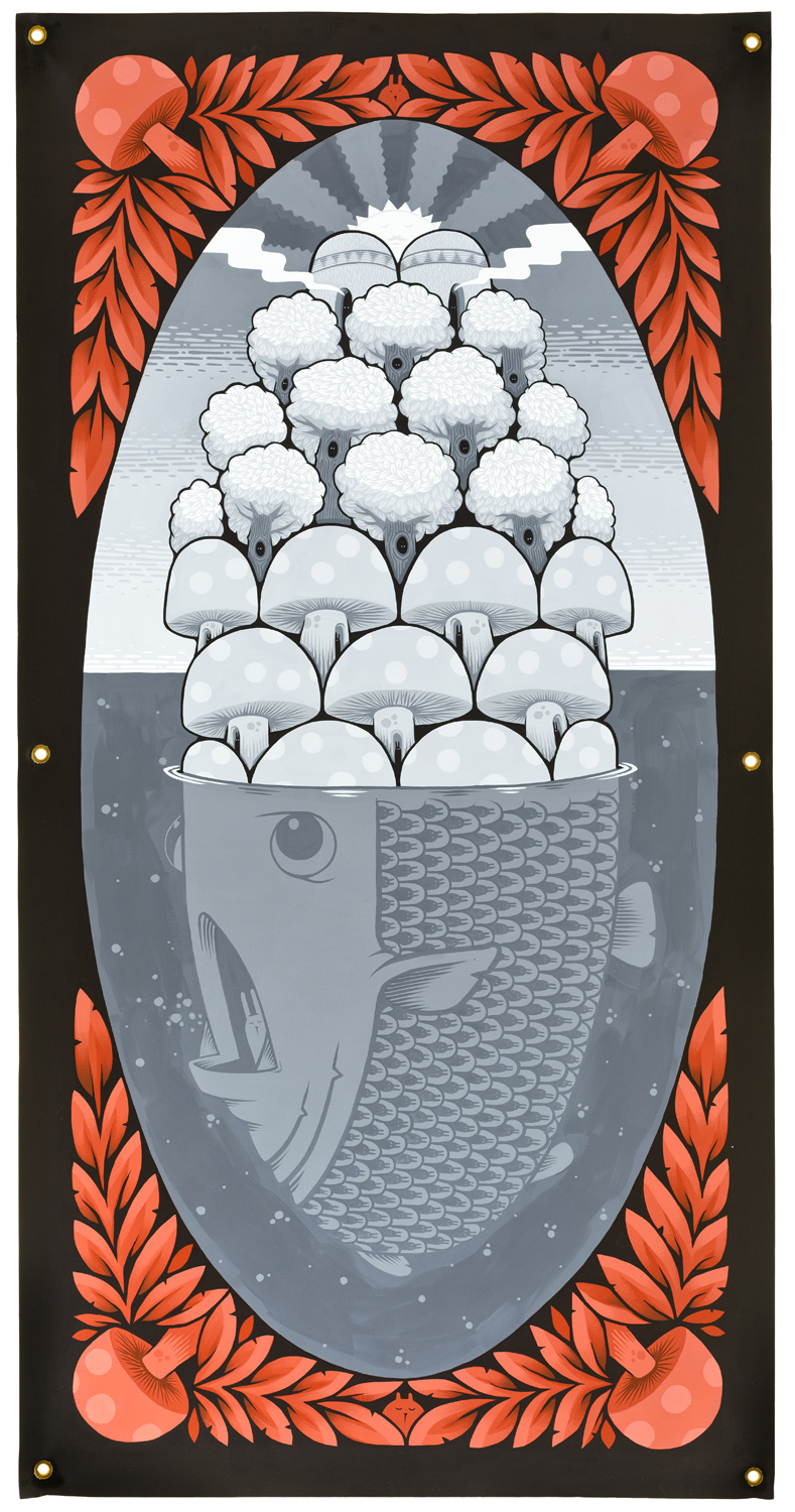
Jeremy Fish, THE MUSHROOM MANSIONS, 2015, acrylic on canvas, 81,3×160 cm